


Dear Creative Mind Website Review

Review Highlights
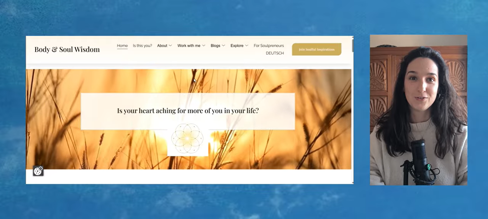
The Uppercase Titles
Uppercase sentences are much harder to read and therefore less inviting. But I see them working well in two situations:
On very short titles
When you want to create a sense of in-your-face boldness, portray something outrageous, or create a big contrast. I mean, you get it — if you want to make a big statement, go for it.
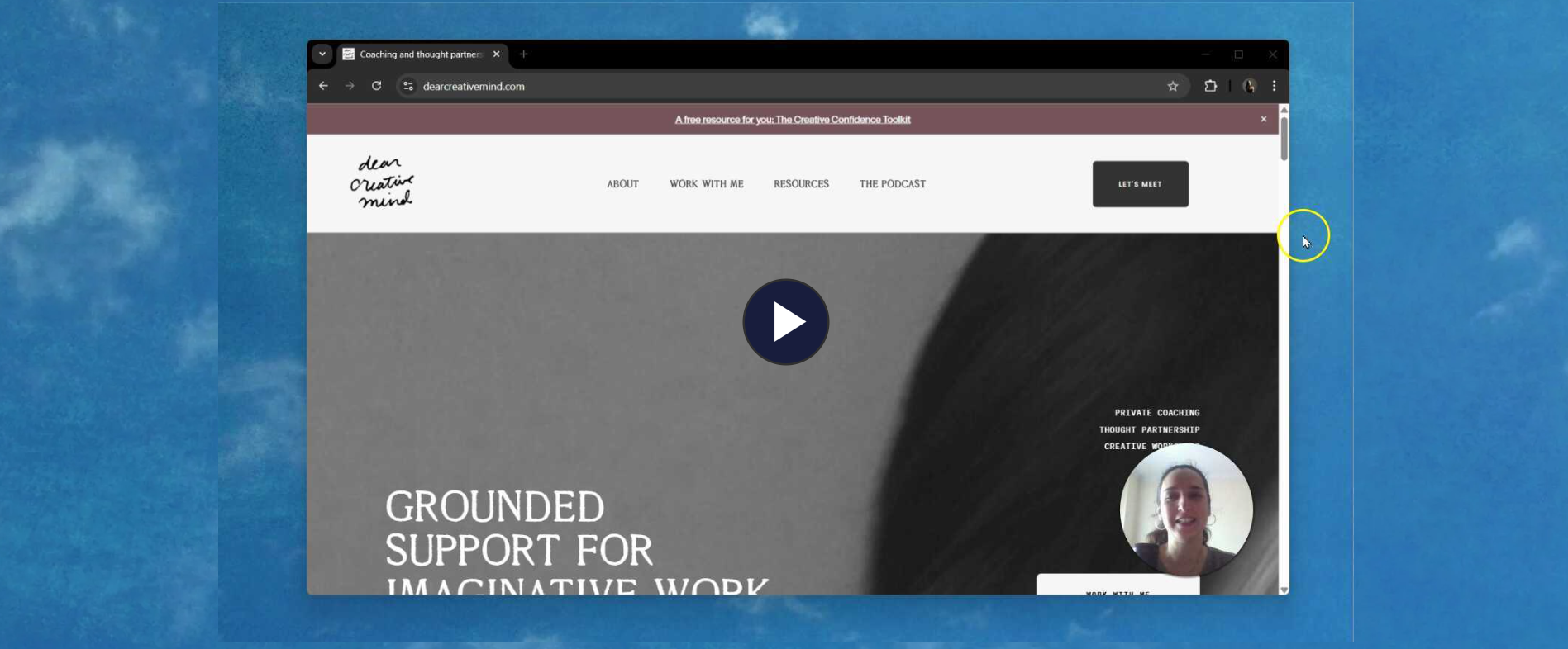
How to display your services
I see generally two ways of displaying your services on your homepage:
Pathway layout
Highlight each service individually
Option 1: The Pathway Layout
six month coaching
→ Book
two-week intensive
→ Book
group program
→ Book
This option works well for services that target the same audience. These services solve more or less the same problem while meeting you where you are.
Laying them out as pathways helps folks get a good idea of what you have to offer them and choose which one they want to dive into first.
Option 2: Highlight services individually
six month coaching
→ Book
six month coaching
→ Book
six month coaching
→ Book
When your services target different audiences, meaning that, each one of them is looking for completely different type of support, I find it best to lay them out individually.
This will allow you to create an atmosphere for each service, as they probably speak different languages for different people.
Do we always need a main service page?
I call the ‘main service page’ the one that outlines your services and points people to other pages when they want to learn more about each individual service.
Meaning that, this main service page is only here to show the different options.
I find that this makes sense when there’s a need to explain the difference between the services.
Example 1 - Explaining the difference
1:1 six-month coaching program vs a 1:1 two-week intensive.
Even though we can easily see that one container is much shorter than the other, we’re still not sure how that affects the outcome. It will be hard for folks to pick one if they don’t understand the difference.
So, in this case, a main service page can do that work by making the differences between services very clear, and folks will be able to pick one with confidence.
Example 2 - unnecessary extra steps
Creative team session vs 1:1 coaching program.
If we can easily understand the difference between your services, there is no need for a main service page.
What can you do instead? — Something like a menu drop-down where we see the titles of each service when we hover the ‘services’ menu.
Does that mean you can’t have a main service page? Of course not! If you want it, go for it! BUT, keep in mind that this is an extra step — an extra page folks will have to read and go through before they get to where they really want to. It’s important to find a balance between what you need/want to say and the friction you’re creating with extra steps. Sometimes it’s worth it, sometimes it’s not.
Inquiry Page
Is it ok so send folks directly to my scheduler?
I don’t think I’ve ever said yes to this question.
Sending folks to your scheduler page is a big step! They just clicked ‘contact’ or ‘let’s work together’ with the intention of finding out how that would work, and you’re straightaway telling them that the time to meet is NOW!
I know a scheduler page doesn’t force anyone to book, but it gives a sensation that we’re already in the process of booking, and, if we’re not quite ready for that, we are forced to reject this step. I mean, it’s not that big of a deal, but if we can avoid this moment, all the better!
What you could do instead: have a page on your website with all the booking info and embed a scheduler there (I think all schedulers allow this). All the same information is there, but it feels more inviting and less “we’re already doing it!”.
Resources Strategy
I’m a huge fan of free resources as a marketing strategy, but I find that we often create them with the sole purpose of helping others, and we don’t carve out space for these resources in our business strategy.
Meaning that, we create, we give away, and that’s it.
It doesn’t mean that doing it this way is a bad thing, but it quickly becomes a problem when we don’t know where to mention them or how to refer to them, have that be on our websites or in our communication in general.
When we create resources without them having a purpose in our business, we often have no reason to talk about them.
Having a clear strategy for your resources is not just about selling through them, but more importantly, it’s about knowing when and how to mention them so they can actually serve their purpose.
Early positioning
In Pascale’s case, she aims to position Dear Creative Mind as a space of hosting events, retreats, and artist residencies (and probably other things I’m not mentioning). BUT, on her website, I couldn’t find any mention of events, even the ones she has already hosted (which have been many!).
I suggested that Pascale should have a section on her footer inviting folks to join the waitlist for future events. This way, even when she’s not planning to host anything soon, her new hosting/facilitating positioning is still highlighted.
This is just a simple way to start shifting our positioning even when we’re still in planning mode.
The dreaded About Page
About pages are often underrated, and I think they are becoming surprisingly relevant as people start to care more about the human side of business, as opposed to being only outcome-driven.
This is a space where you get to share your transformation story, fun things about you, and stuff your people can relate to. Also, much more! This space has fewer strategic ‘rules’, so you can have more fun with it.
I found Pascale’s approach really lovely. She created a beautiful harmony between bringing forward her business ethos and fun things about her, without feeling too corporate or too performative.
I’ll be taking notes from this page for future reference!
More from the Archive
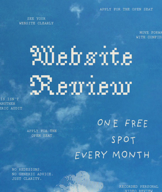
Apply for a Free Website Review Spot
Every month, we give away one free spot.
No Redesign, no generic advice, just clarity.
Your interpreter + expander.

Olá, I’m Ana Luísa
I’ve learned that showing up for the messy, uncomfortable parts of work and life is where the interesting stuff lives — the part that actually matters.
I care about doing things our way, even when it goes against the rules, the blueprints, or what everyone else thinks makes sense. And honestly? It’s hard. I doubt myself all the time.
But that’s also why I care so much — because I know how real and raw it is to try anyway.
And that’s the place I want to create with you — honest, a little raw, and completely human.

/ free Playbook
delivered in notion
Connect with your brand intuition
Free Intuitive Groundwork Playbook
A small pause
to gather what it feels like inside your brand.
Connect with your vision before you get into strategy mode.